Friday, August 31, 2012

And the Altered Box is covered!

Hello All!

Whew! I have been a crafting nutcase the past few days. I am working really hard to finish the outside of the altered box project. Its been going really well and I cant wait to show you all the progress.

Here it goes! 


This is the chip board accordion piece that I showed in an earlier post. I have cut it apart into individual sheets and gesso'd it. The reason for cutting it was that it seemed to be held together with masking tape that was getting brittle. I didn't want the project to be flimsy so I decided to separate them. I can always put it back to an accordion with new hinges!


Here is the paper collection I am using to make this project. It is by Iron Orchid and called Loolah. I bought it at the Scrapbook Expo. Its a 6x6.75 inch pad and is the perfect size for this project. I love using a smaller pad for this instead of trying to cut down a 12x12. I feel you lose to much that way in regards to the paper pattern and look. 


Above is the side of the box. To get more of the white wash look, I used my finger and LIGHTLY smeared some more gesso on the paper and around the edges to soften the look. I absolutely love how it turned out!!


Last but not least is the top of the lid. I really like this pink paper. Its hard to tell in the picture but it has a damask look to it in pink tones. 

So far this is the progress. Slow going but I wasn't to sure what I was aiming for when I started! LOL After fiddling I am leaning toward a shabby chic look. I think its off to a great start! 

Thanks for following this project. Keep checking back in to see how its going!

Have a great night!
Sarah 

Tuesday, August 28, 2012

Altered Box Project

Hello all!

This is a new project I am bringing you. Its is a small box that I am going to alter and create some sort of mini or tags to go inside. What I would like to do is to show you the steps I am taking and kind of how I am doing it. I have never altered anything really so I though it might be fun to see the project in stages through photos. I started last night so I am not behind yet LOL I did however, have this brilliant idea after I had already gesso'd the box, so please forgive me! 


Here is my starting point. Its an accordion fold chipboard piece, the box it fits in (below), and white gesso by Artist's Loft. 


After I painted the box with the gesso, this is what it looked like. It was originally the same color as the accordion piece.

So far, that's all I have done. Did I mention that I started about 1 in the morning? LOL So stay tuned, there is a lot more to share!

Thanks for popping by!
Sarah


Sunday, August 26, 2012

30th Birthday Layout


Hello Again!

I'm not sure what I was thinking, but I decided that one fair entry wasn't enough, so I decided to enter a layout as well. After thumbing through many idea books, magazines, and Pintrest, I combined about 3 different ideas, and this is how it came out. I will keep you posted on both entries and let you know how it goes. 

Thanks for stopping by! 

Sarah 

P.S. Sorry the picture isn't as detailed as normal. It was a lot harder than I thought to capture the whole layout!!

Olde Curisosity Shoppe Card


Hello Everyone!

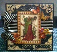
Below is the card I created to enter into my local fair. It is a 6x6 card with a black card stock base.  The decorative papers are from Graphic 45's Olde Curiosity Shoppe collection. The rest of the accents were odds and ends from my stash. I am super excited about how it turned out! The next week is going to be agony waiting for the fair to open and see how I placed. I will keep you posted on results!


The charm above, is from Michael's. It is part of their Bead Landing collection. I absolutely love how the clock is deconstructed to see the inner gears. It finished the card beautifully! 

Thanks for stopping by!
Sarah 

Thursday, August 23, 2012

Embossed Art Tag


Hello All!

This is my most recent creation. A tag using some Tim Holtz stamps I got recently at my Jo-Ann's (on clearance no less!). I have been wanting to experiment and play with all of my supplies for some time now, but I have a hard time just letting myself go and not following a pattern LOL. Its a trait of mine that usually comes in handy (as a medical assistant I have to be VERY precise) but when it comes to creating, its a bit hindering. So for the past few weeks, I have been trying to push myself to just wing it. No sketches (unless I draw them), no patterns, and no running out to buy anything unless I run out (adhesive).

For the tag, I love the quote, which reads, " Creativity is allowing yourself to make mistakes. Art is knowing which ones to keep." I find it very inspiring and wanted to make something to hang in my space with it. Since space is limited, I thought a tag was the way to go. I tried to use a variety of techniques such as misting, embossing, layering and distressing. All things I have done but not usually all on the same project. I really like how it came together, and it was fun to make. I am definitely going to make more to see what else I can come up with. This is only the beginning!

Stay tuned, I have another project to show you either later tonight or tomorrow depending on when I put the finishing touches on!

Thanks for stopping by!
Sarah :)

Monday, August 20, 2012

A Mixed Media First


Posted by Picasa
 My very first mixed media project. I am so happy with how it turned out and I cannot wait to do some more! Where did I get the idea you say? From YouTube! On one of the channels I follow, Jennings644, I saw an amazing heart tag. I love all the texture and color!After watching the video (and a few others) I decided I absolutely, positively HAD TO make one! So it was off to the craft store, to get some modeling paste and knives so that I too could create one. After my shopping spree, while some accents for another project were drying, I got out all the goodies and tried my hand at a tag. I did have some trouble with the UTEE and it not wanting to cover the heart. It took a lot of finesse, but I think it worked!

Thanks for stopping by!
Sarah


Saturday, August 18, 2012

First YouTube Video

Well its out there! LOL I just completed my first YouTube video. I didn't realize it but I do not like speaking on camera. I don't know why, since I have no problem teaching or with public speaking, but on camera is a different story. In the video, I showcase the Vintage Disney Suitcase that I finished. It was on my blog a few days ago but I want to start making videos, and I though that would be a good one to start with.


Please watch, leave a comment or 2 and let me know what you think!

Monday, August 13, 2012

Vintage Disney Suitcase


Posted by Picasa

Here it is! The Vintage Disney Suitcase! Finally its a complete box, decorated, also a piggy bank (the slot is under the handle) and holding some savings for our trip to Disneyland for Halloween. It constructed from foam board, card stock and LOTS of glue, ink and glimmer mist! The small icons are stamps of Mickey Mouse images, giving it kind of a Louis Vuitton feel. The only thing missing is a luggage tag and that will be completed tomorrow! I am really, really happy with how it all came together. As you may recall, this was something completely from my own imagination that I brought into reality. 

Once I get the luggage tag complete, I will post more pics, including some close ups. I hope this inspires you to create something that has been living in your imagination! 

Saturday, August 11, 2012

Accessories for Vintage Disney Suitcase

Here are some pics of 2 of the accessories I made for my Disney Vintage Suitcase. The first one is the side straps. I have taken Tim Holtz grunge paper and used ink and glimmer mist to get it that vintage leather look ( bottom pic shows color better). The Mickey icon is just 3 brads from a pack I had in my stash.


The second accessory is the luggage handle.  Again its grunge paper, distressed to look like leather. This is a better picture to show the coloring.


Enjoy and please keep checking back. The suitcase is almost finished and I cant wait to show you!
Posted by Picasa

Monday, August 6, 2012

Scrappy Key Chain


This is something I put together from a free make and take at the Scrapbook Expo. Inside the top square piece, is the clear 1x1 glass tile that I created at the Expo. It was at the Craft Fantastic booth. You picked an image ( it says scrap diva) and then using something similar to glossy accents, adhered it to the back of the tile. I love how it came out! Afterwards, I immediately thought that it would make an awesome key chain.

 At the booth, they were not selling individual holders, so it took me a few weeks, but at my local scrap store, I found some Ranger metal frames that were perfect. Once I had the frame, it was off to Michael's. Tonight I found the perfect additions. They are the art charm and the crown, from the Art-I-Cake line. The A is wooden, similar to a Scrabble tile, the T is similar to a ceramic tile and the R uses the same technique I used to make the large tile. 


I am so excited with how it turned out. Who knows, I might be adding charms to everything now! This is now proudly on my key ring and it will inspire me everywhere I go. 


Posted by Picasa